
Company: Wuffes
Date: Aug 2024
Objective: The rebrand aimed to create a clean, distinctive identity that set the company apart from competitors while evolving with business priorities.
Phase 1: Establish Wuffes as “The Joint Experts” in the pet wellness space, with a strong focus on joint health.
Phase 2: Educate customers on the brand’s four pillars of joint health, reinforcing authority and trust.
Phase 3: Expand beyond joint health into a full spectrum of dog wellness, repositioning the brand for both D2C and retail markets.
• The existing brand felt generic and failed to stand out in a crowded market
• Customers desired a stronger sense of trust, expertise, and science-backed authority
• Messaging lacked consistency across channels, limiting recognition and retention
• The brand identity did not easily scale to retail packaging and broader product categories
• Developed a refreshed visual identity that balanced clean, modern design with warmth and trustworthiness
• Crafted a distinct logo and typography system that stood apart from competitors while remaining fun and approachable
• Built a color palette and illustration style that could flex from joint-health focus to a full wellness spectrum
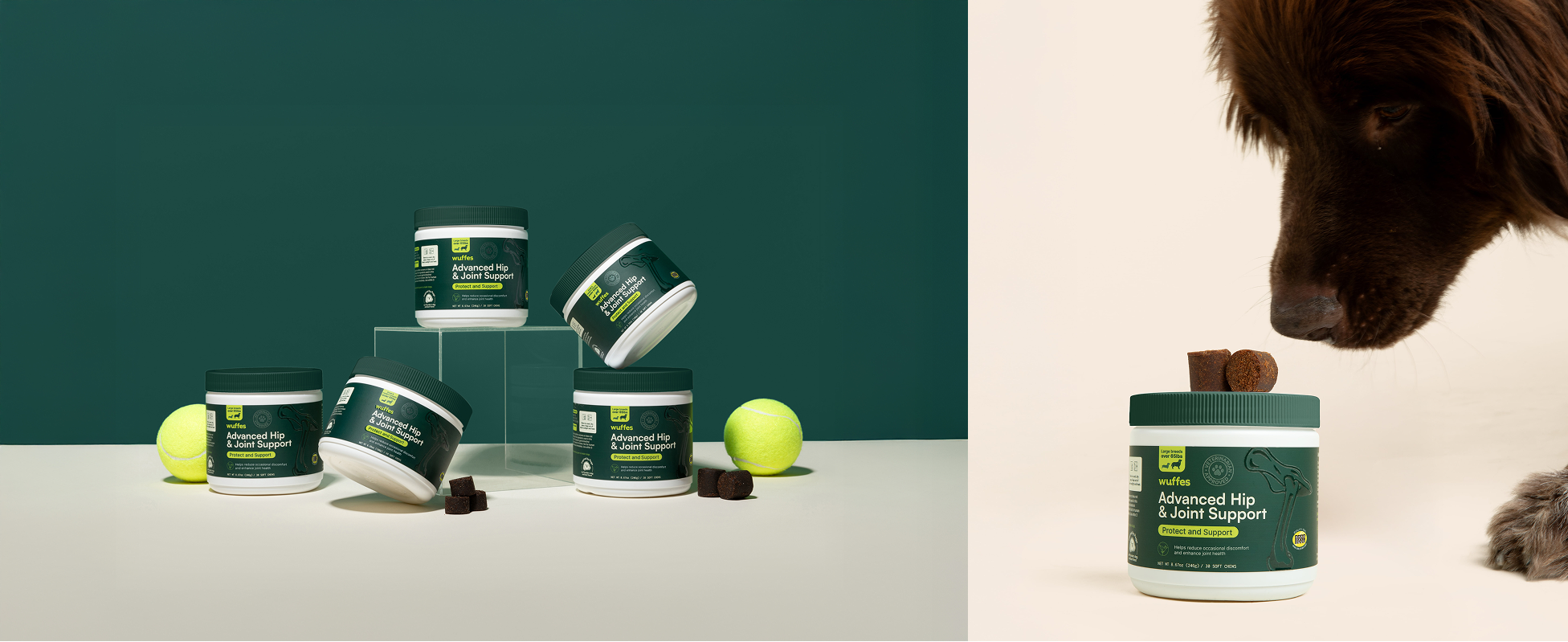
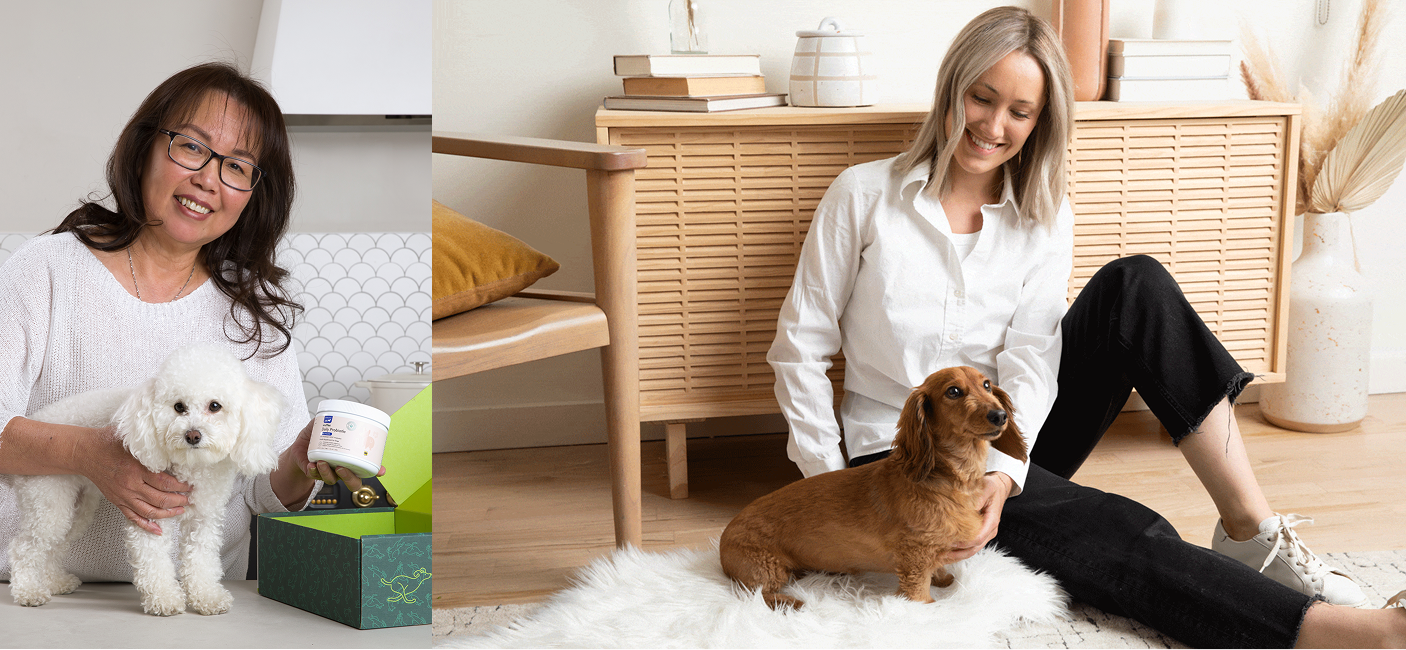
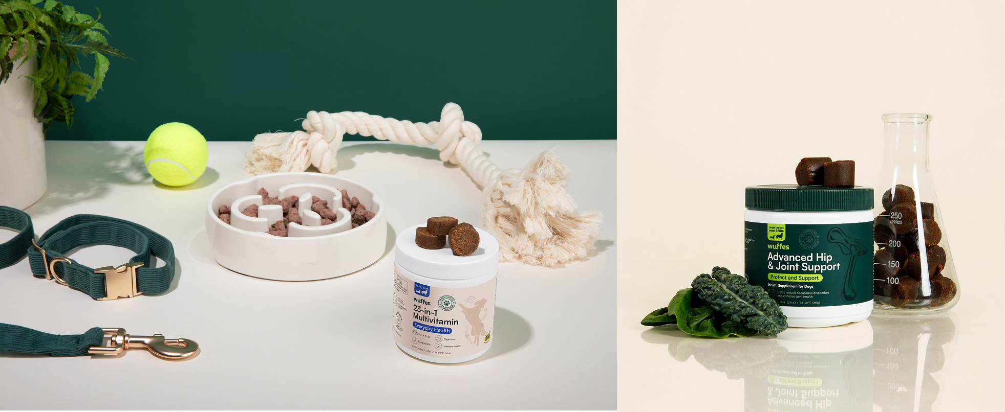
• Directed a brand photoshoot to capture authentic, lifestyle-driven imagery that elevated storytelling
• Designed packaging and digital templates that supported both D2C and retail environments
• Established Wuffes as a recognizable, trusted brand in the pet wellness space
• Successfully positioned the company as “The Joint Experts” while laying the foundation for broader wellness offerings
• Strengthened brand consistency across digital, packaging, and retail touchpoints
• Supported the transition from a single-focus D2C brand to a full-spectrum wellness company with retail readiness
• Enabled ongoing growth and adaptability through a scalable brand system
• Recieved positive feedback from our customers and community in relation to our new look

Improving the quality of life of dogs with powerful supplements that promote great joint health.

We’re the Joint Experts.
Our mission is to improve the quality of life of our furry best friends
As Pet-Super Parents, we know our pets are the absolute best, which is why we built a company whose sole focus is to ensure they can live their best lives for as long as physically possible.
With a foundation built on scientific research and a genuine love for pets, we lead the way in joint health products. Our team of in-house scientists and pet-loving experts create unbeatable products that keep our furry friends happy and pain-free, so they can be their awesome, back-seat-farting, rolling-in-what-they-shouldn’t-have selves.
Long Live Pets.
Color Pallete
The choice of green and beige as the main colors for Wuffes is purposeful and strategic. Dark green conveys a sense of health, vitality, and naturalness, perfectly in line with our mission to enhance the well-being of dogs. Lime green, reminiscent of a tennis ball, injects a playful and energetic element into the mix, reinforcing the connection between our products and the activities that bring happiness to both pets and their owners. Beige, on the other hand, adds warmth and softness to the palette. It suggests a sense of comfort and reliability, creating a welcoming and trustworthy feel for the brand. With green, lime green, and beige harmonizing together, we're not just a dog supplements company— we're a symbol of care, vitality, and trustworthiness in the world of pet wellness.

Visualization
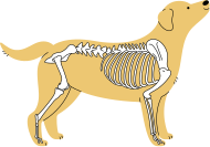
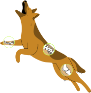
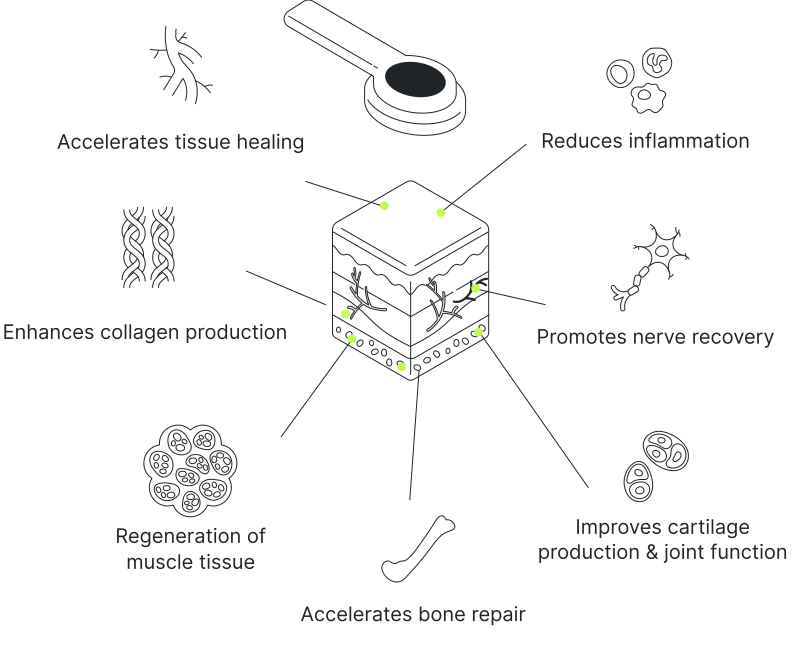
To make pet joint care approachable and relatable, we introduced a friendly illustration style that captured both the science and the joy of pet ownership. The illustrations highlighted our love of dogs while simplifying complex concepts, making it easier for customers to understand the importance of joint health. This playful yet informative visual language became a cornerstone of the brand’s storytelling, balancing education with warmth and accessibility.


Typography
For Wuffes’ branding the typefaces Satoshi and Inter were selected to balance approachability with clarity. Satoshi’s geometric yet friendly letterforms give the brand a modern, trustworthy feel while maintaining warmth. An important quality for a pet-focused company centered on joint health and wellness. Inter, with its clean and highly legible design, was selected for digital interfaces and longer text, ensuring that educational content about pet health is easy to read across devices. Together, the two fonts create a system that feels professional and credible, but also approachable and caring, reflecting Wuffes’ mission to make pet wellness both accessible and trustworthy.
Photography
For Wuffes’ photography, we focused on a visual style that blends lifestyle warmth with scientific credibility. Imagery of pets in natural, joyful moments with their owners, highlighting the everyday benefits of joint health and wellness. To balance this emotional storytelling, we paired lifestyle shots with clean, precise imagery that subtly nods to science and innovation, such as close-up details, neutral backdrops, and structured compositions. This mix ensures the photography feels both relatable and authoritative, grounding Wuffes’ brand in the trust of science while celebrating the bond between pets and their people.